Top Metrology.
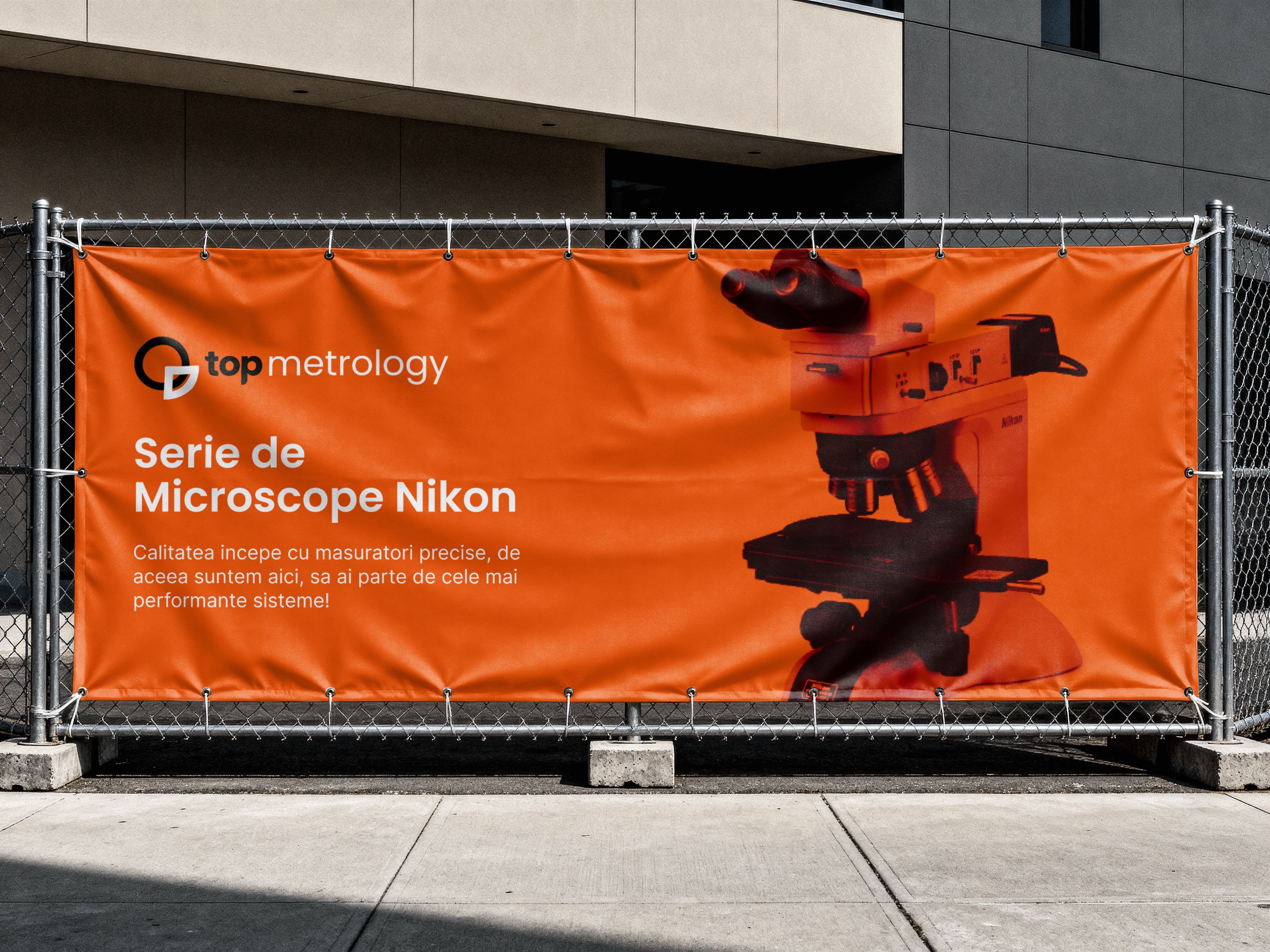
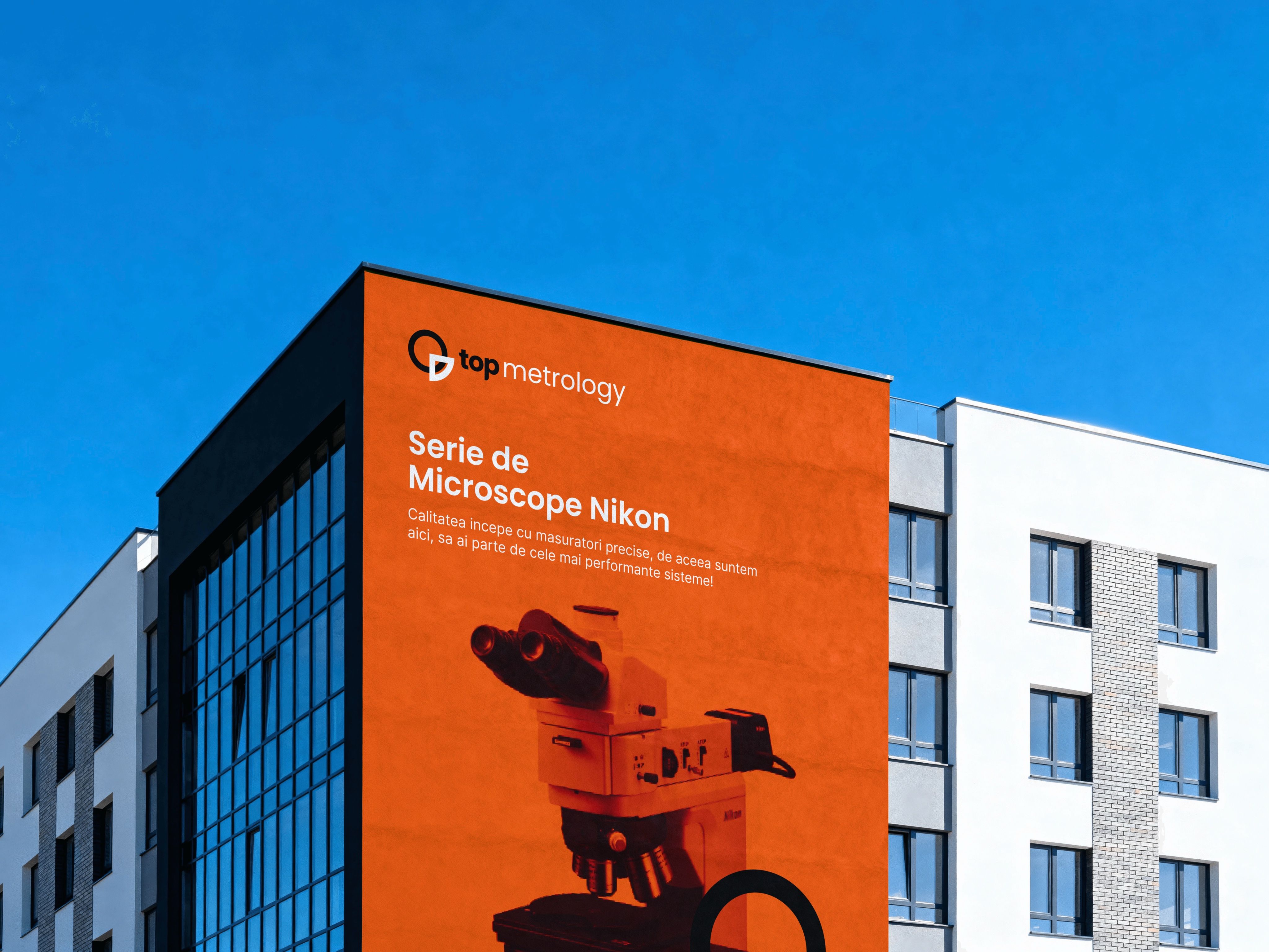
Top Metrology works in precision measurement; its banners announce a series of Nikon microscopes. I designed the identity: a mark built from a circle and a measured quarter, a warm orange, and a pattern that takes the brand from a business card to the side of a building.
- Role
- Brand designer
- Scope
- Logo and identity
- Applied on
- Stationery, cards, banners
- Palette
- Orange, yellow, black
The idea
A mark you could measure with.
Metrology is the science of measuring, so the logo is built like a measurement: a full circle, and next to it the quarter that has just been measured out.
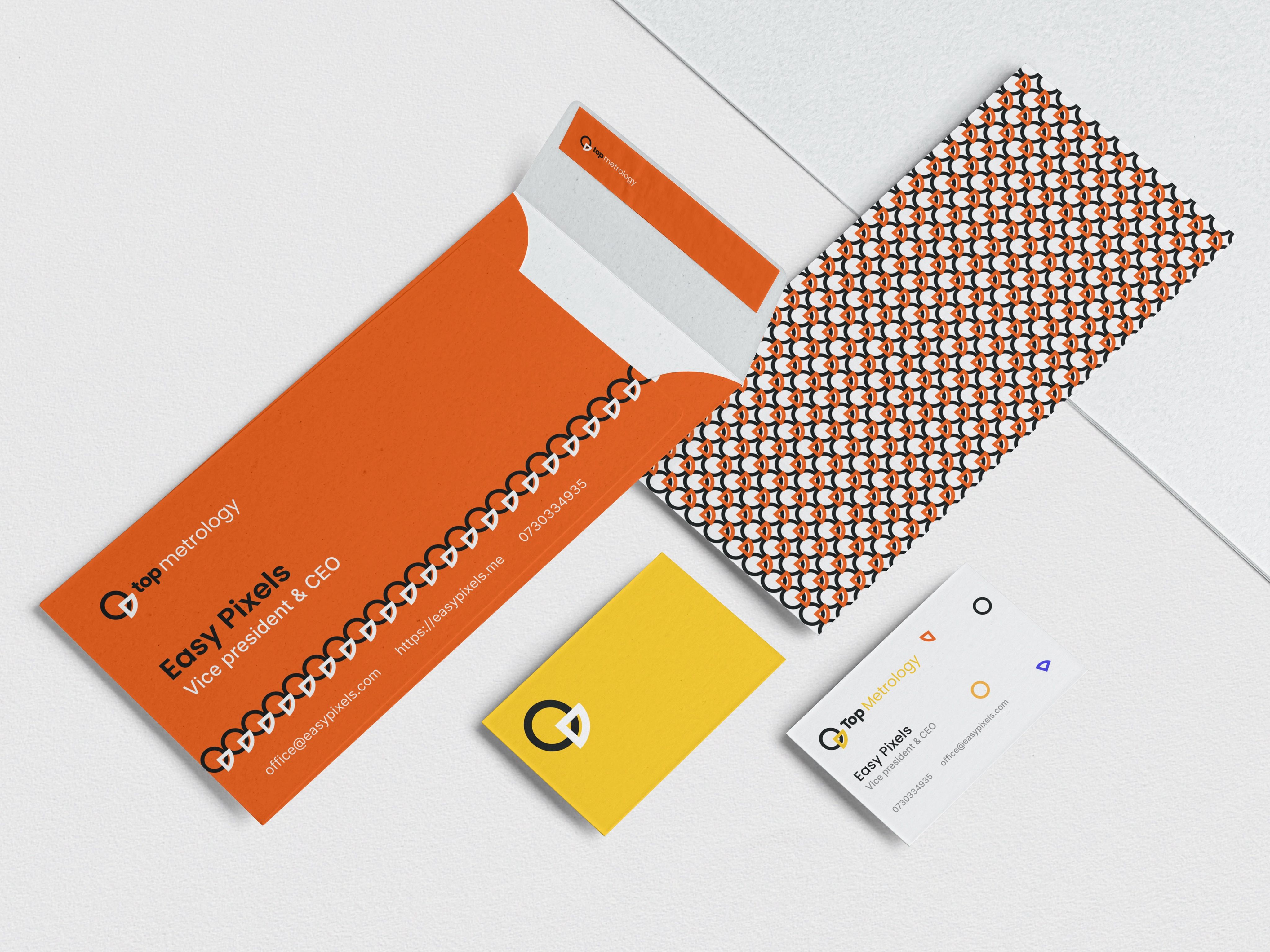
Around it, an orange that can be read from across a building site, and a pattern made only from the mark, tight and regular like the lines on a scale.
Behind the mark
Two shapes do all the work.
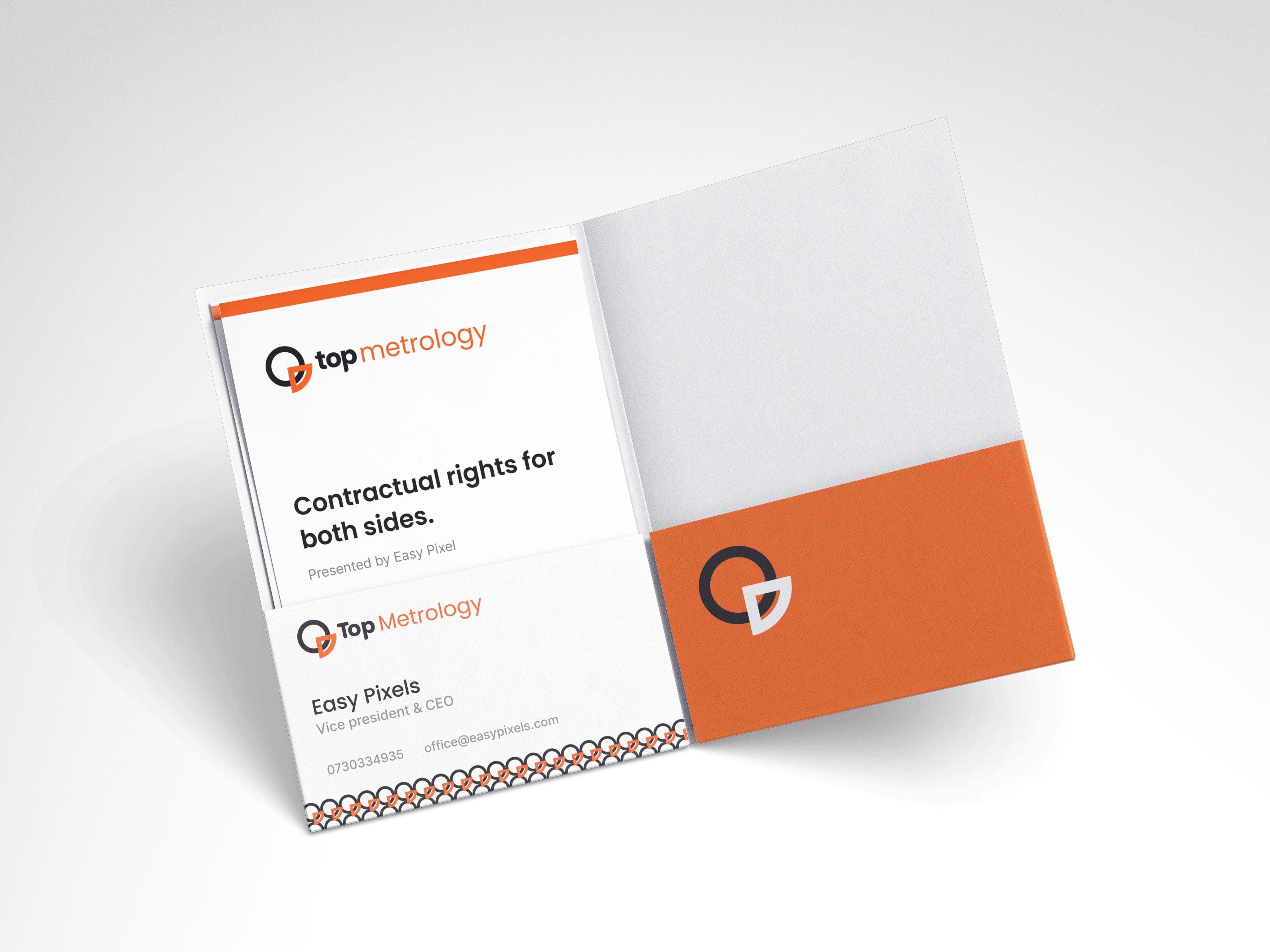
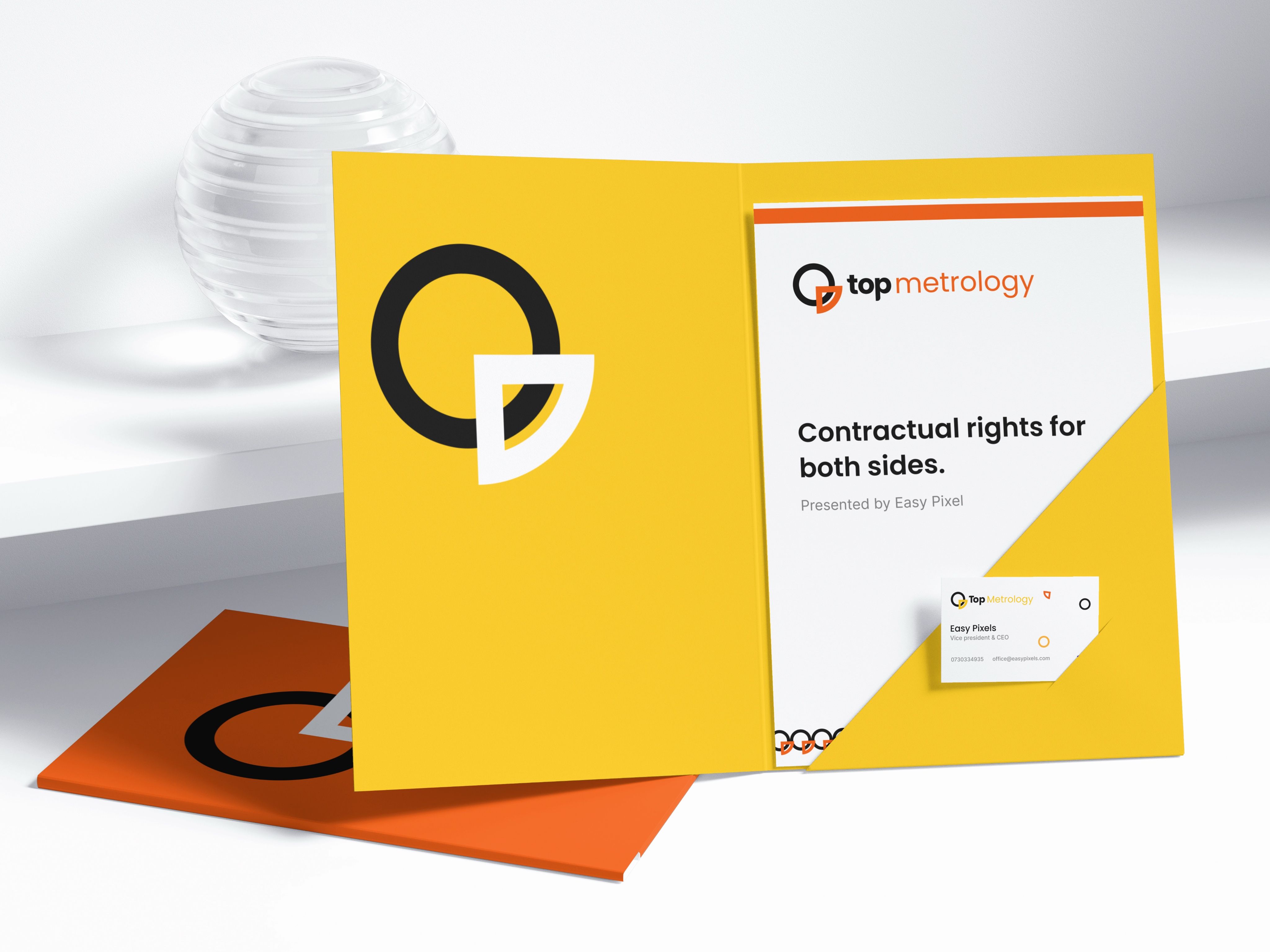
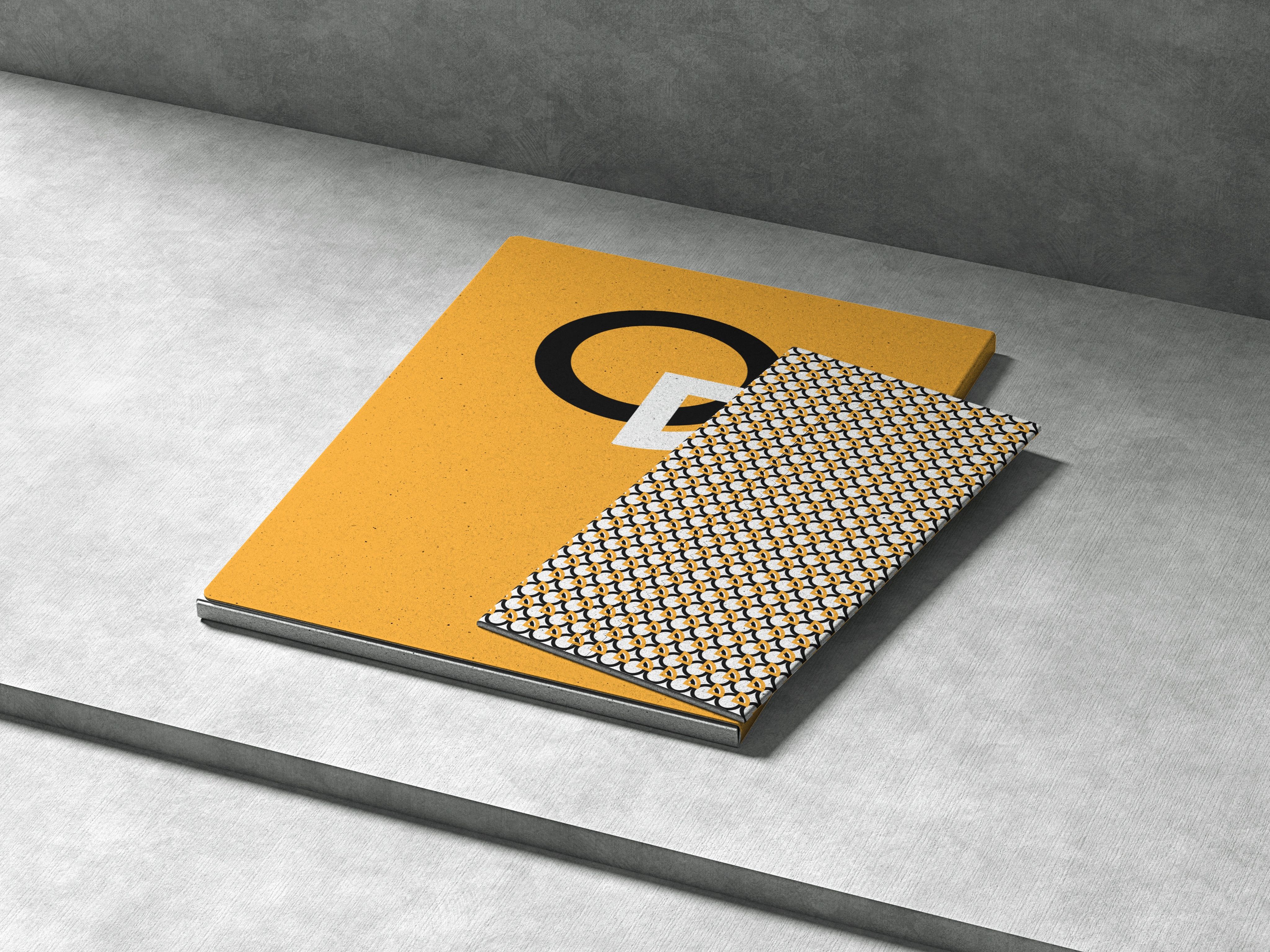
Large, the circle and the quarter sign a banner on a building. Repeated, they become the pattern on the folders and on the back of a business card. Small, they sit next to the name on a letterhead.
What it covers
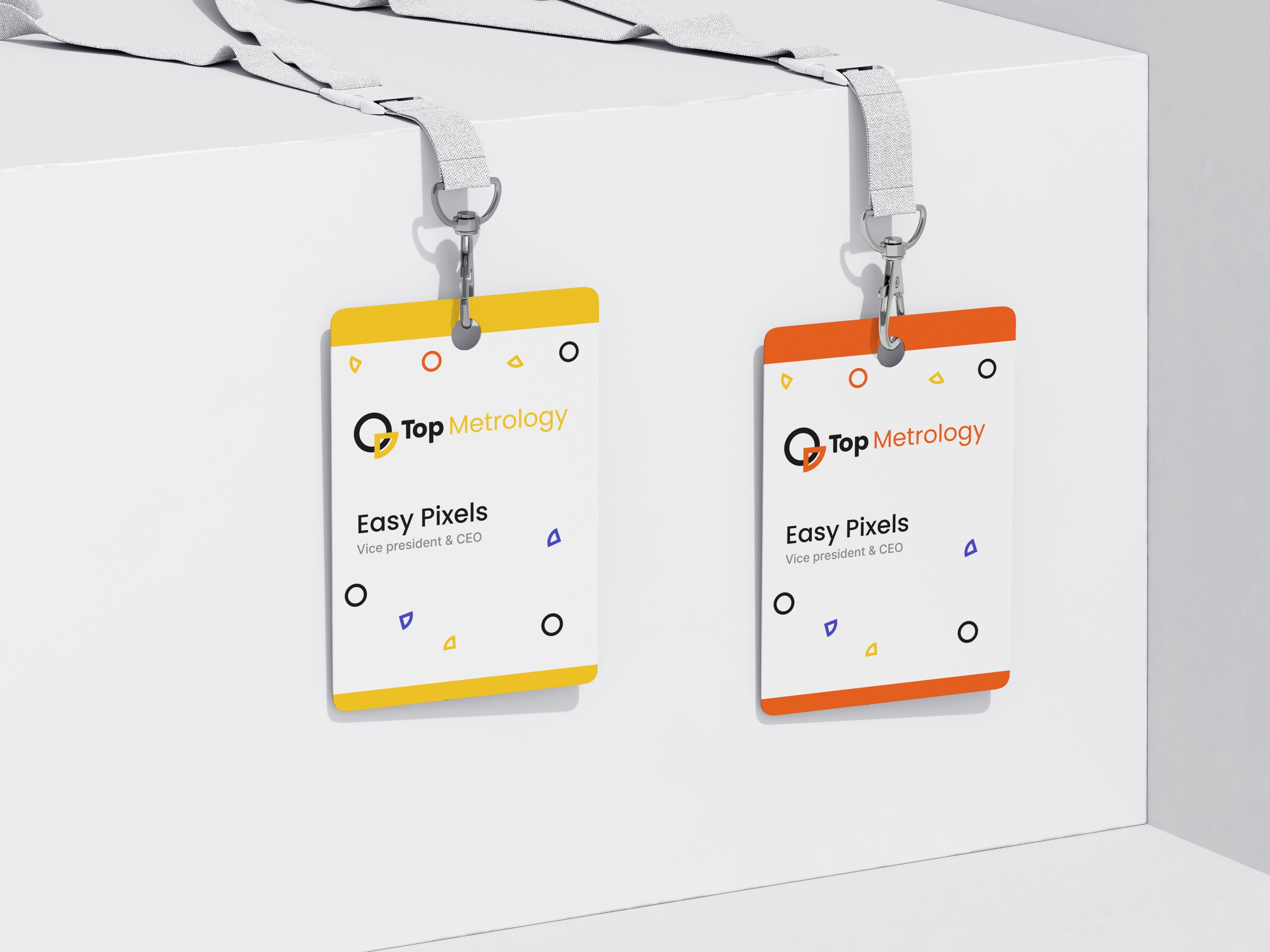
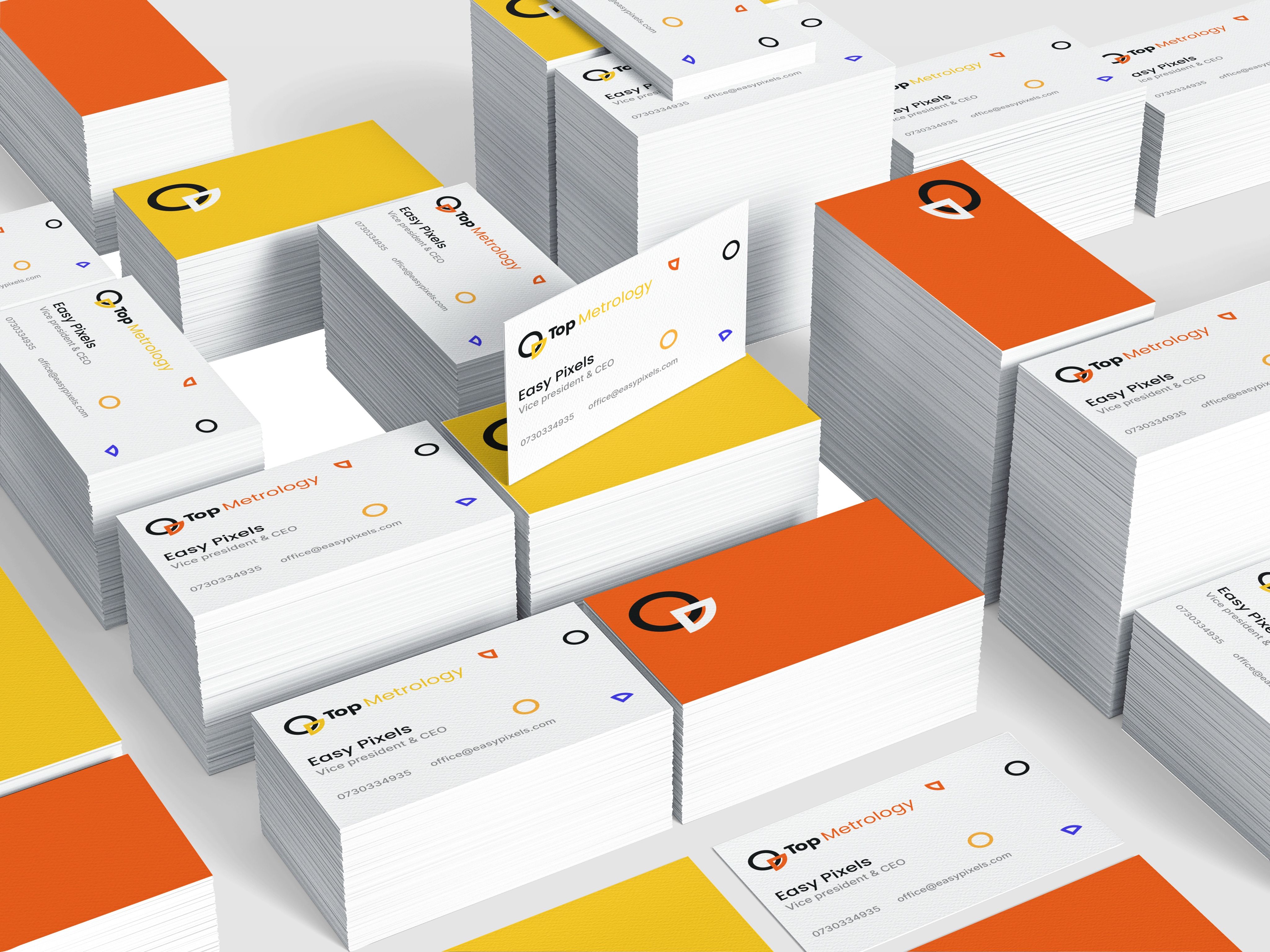
The logo and its pattern, business cards, folders with their letters, an envelope, name badges, notebooks, and banners for a fence and for a building.