La Marian.
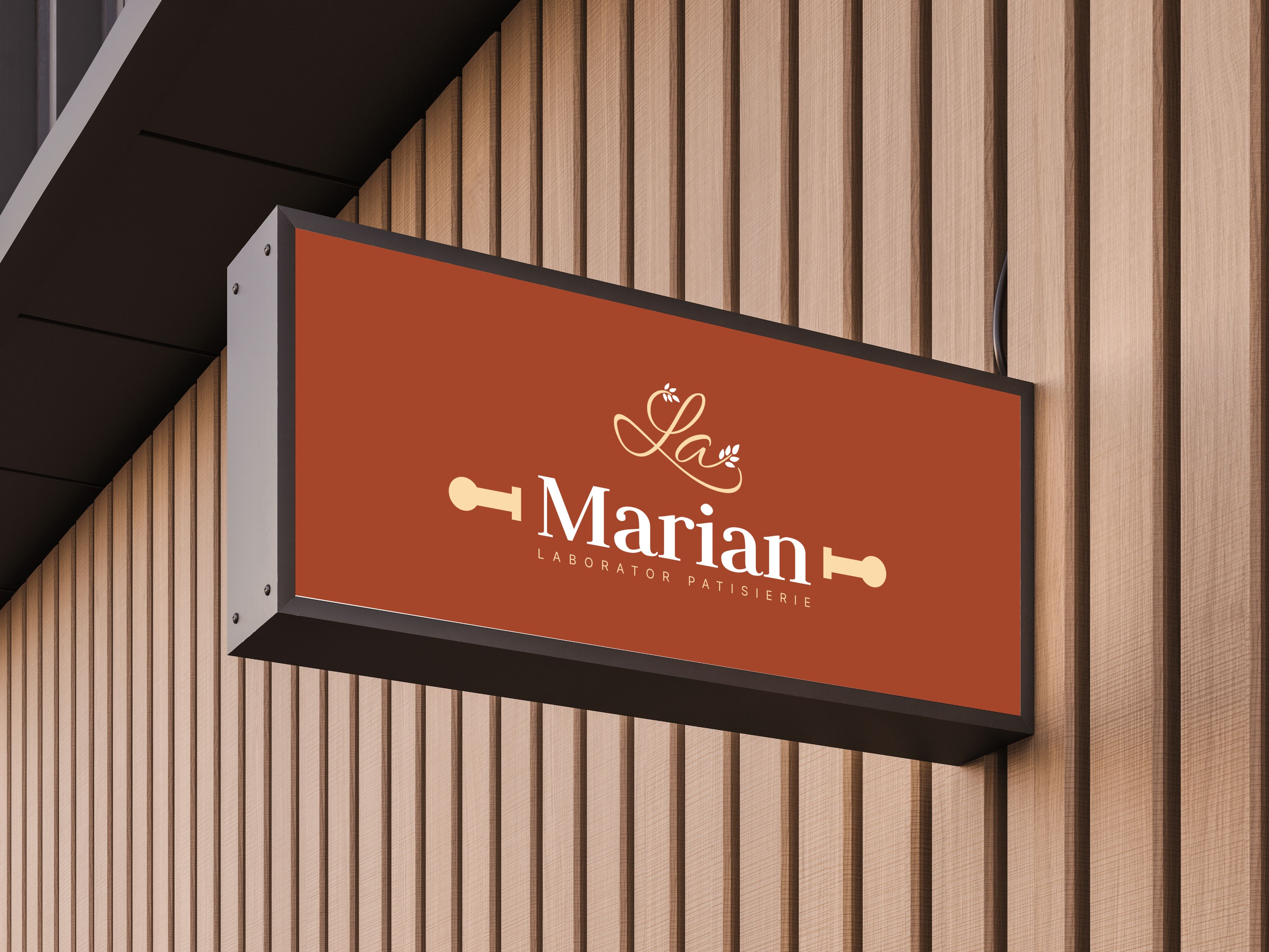
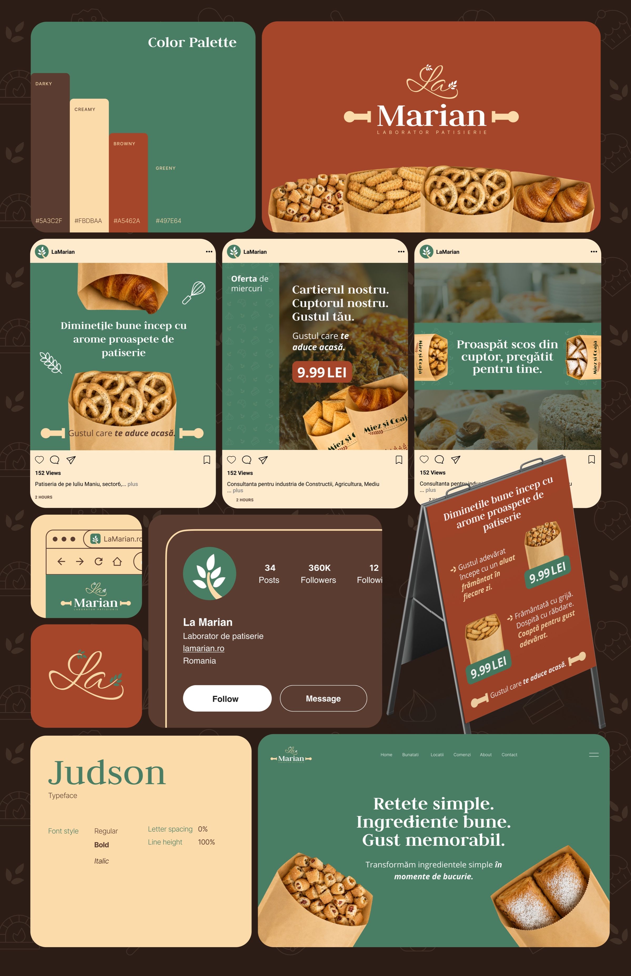
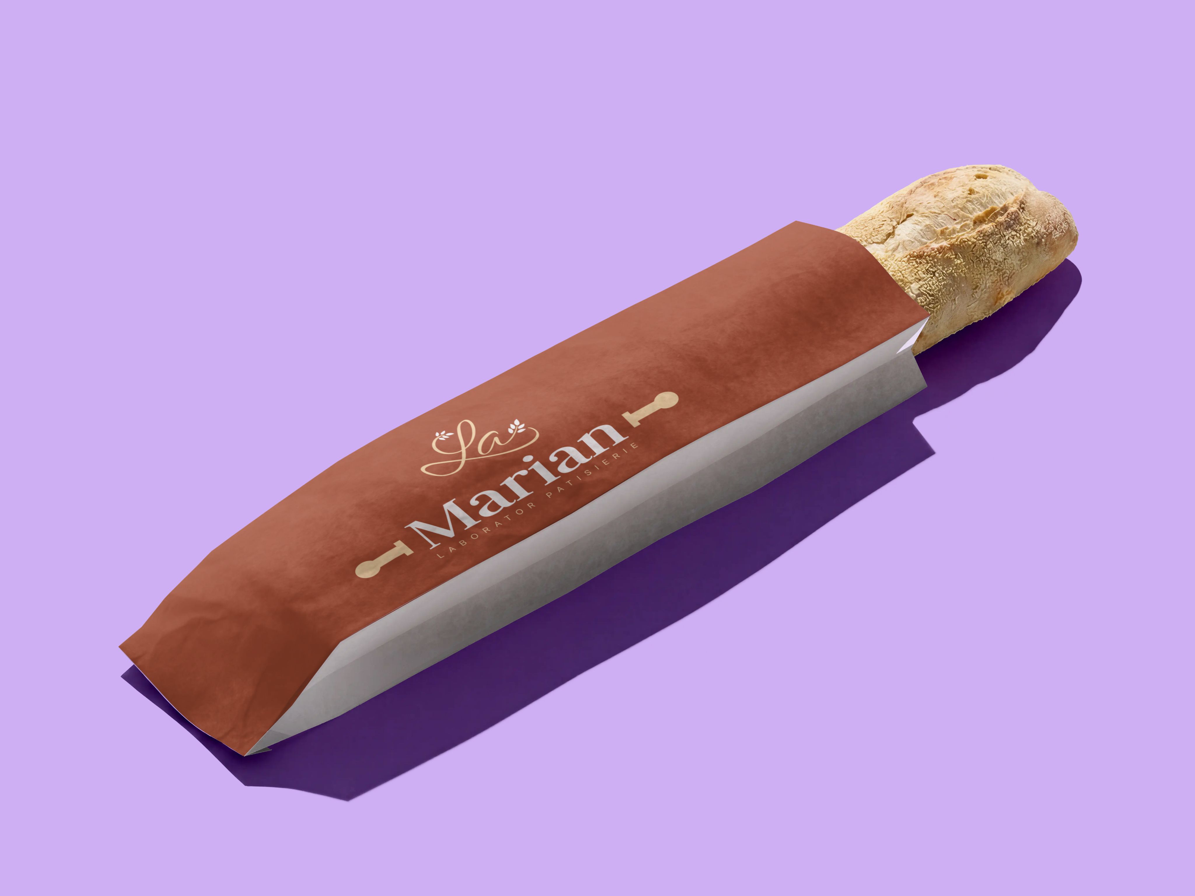
La Marian is a pastry workshop that bakes pretzels, croissants, pies and bread every morning. I designed the identity: a handwritten “La” over a sturdy serif name held between two rolling pins, warm brick and green, and packaging that carries the bakery out the door.
- Role
- Brand designer
- Scope
- Logo and identity
- Applied on
- Packaging, signs, social
- Palette
- Brick, green, cream
The idea
The taste that brings you home.
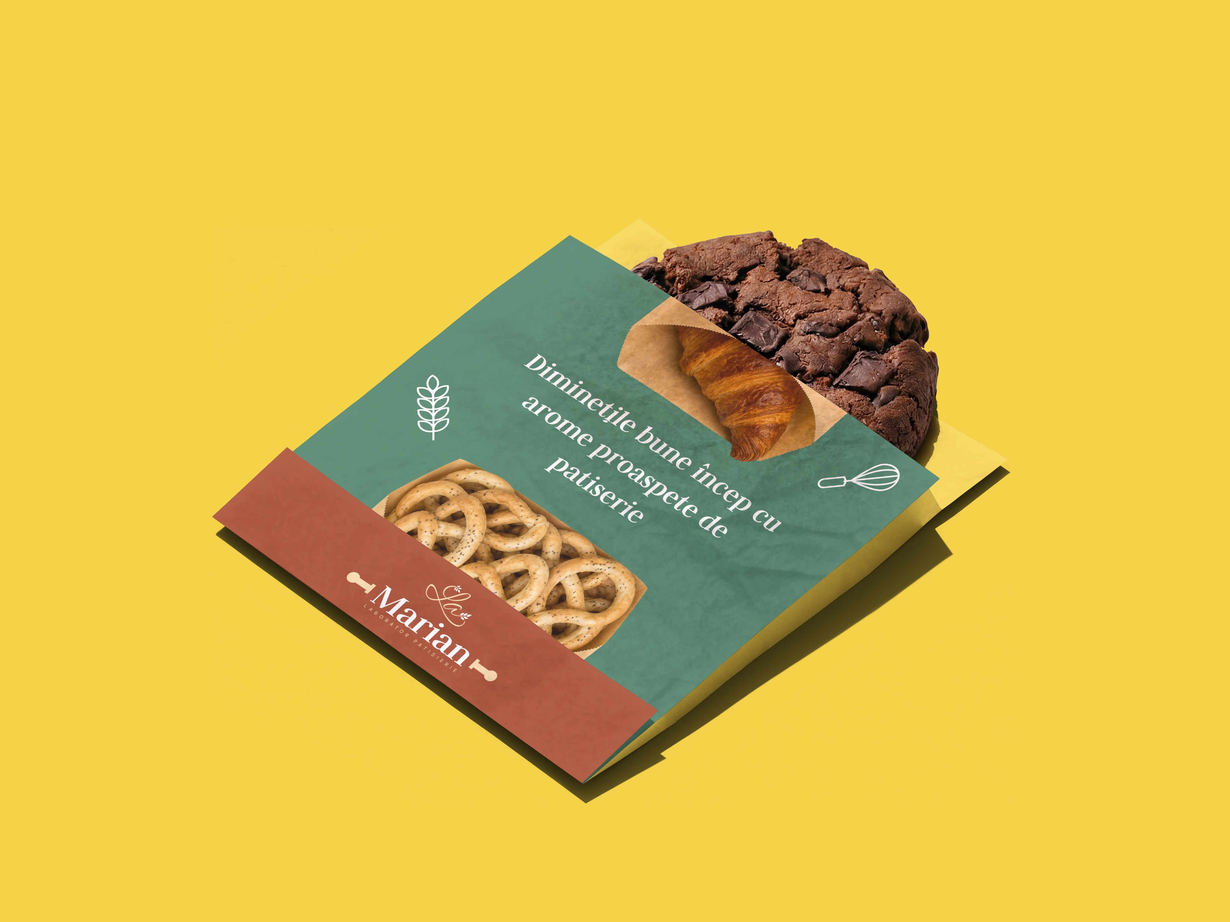
A neighbourhood bakery should feel like a kitchen you already know. So the name is signed the way a recipe card is: a loose “La”, then “Marian” in a sturdy serif, held between two rolling pins.
Brick red for the oven, green for the morning, cream for flour and paper bags. Simple recipes, good ingredients, a taste you remember.
Behind the mark
Made to be carried.
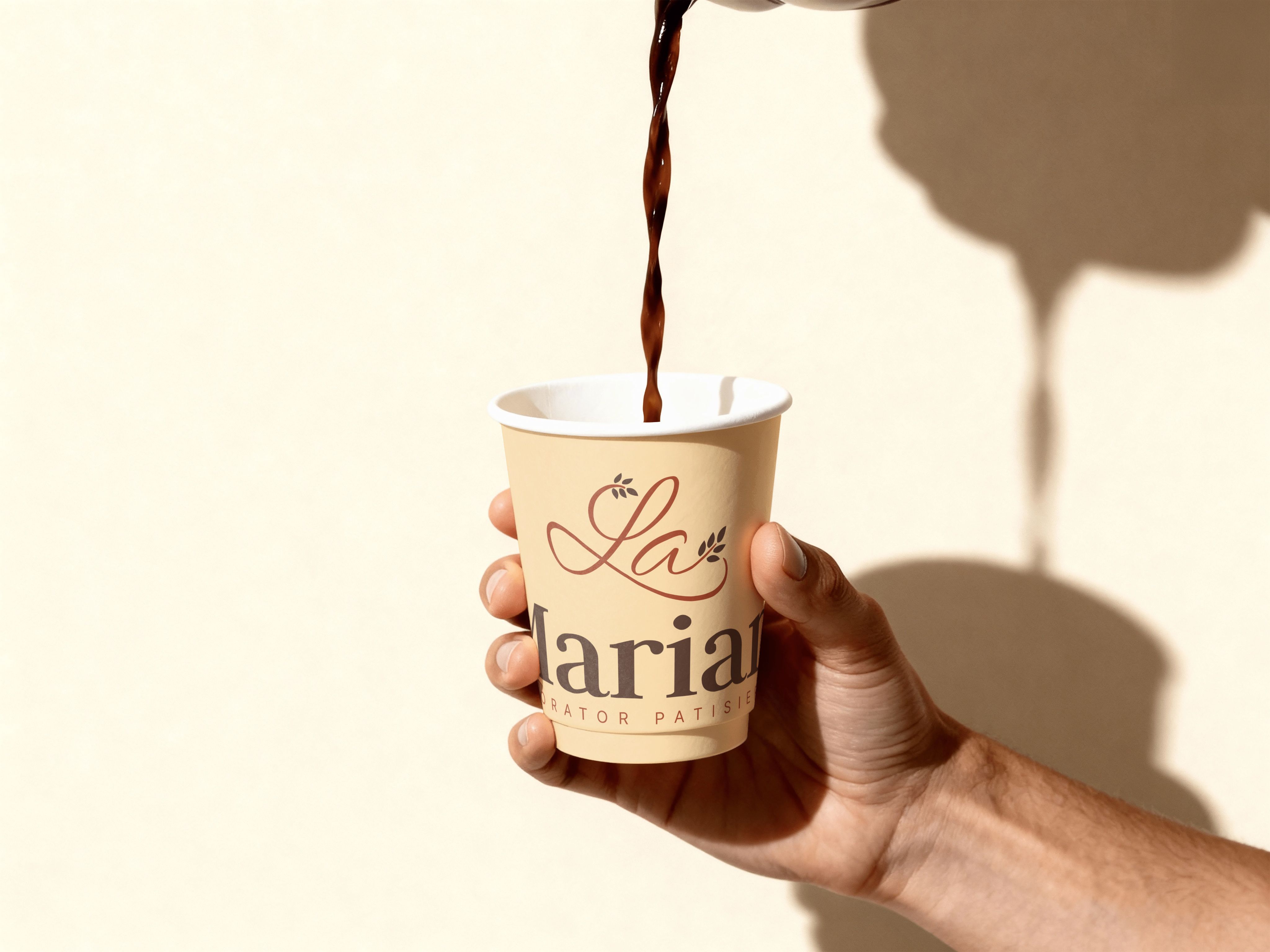
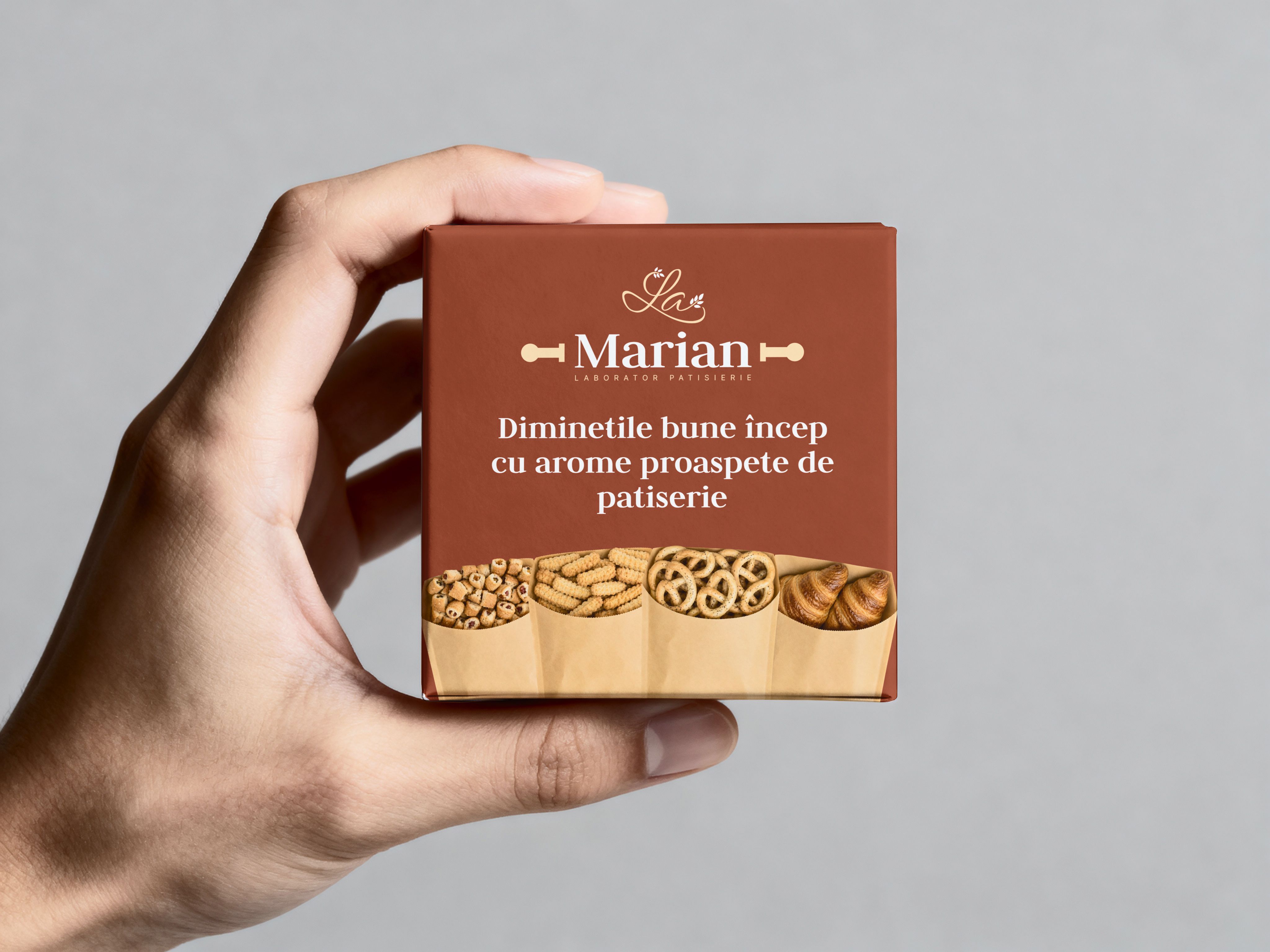
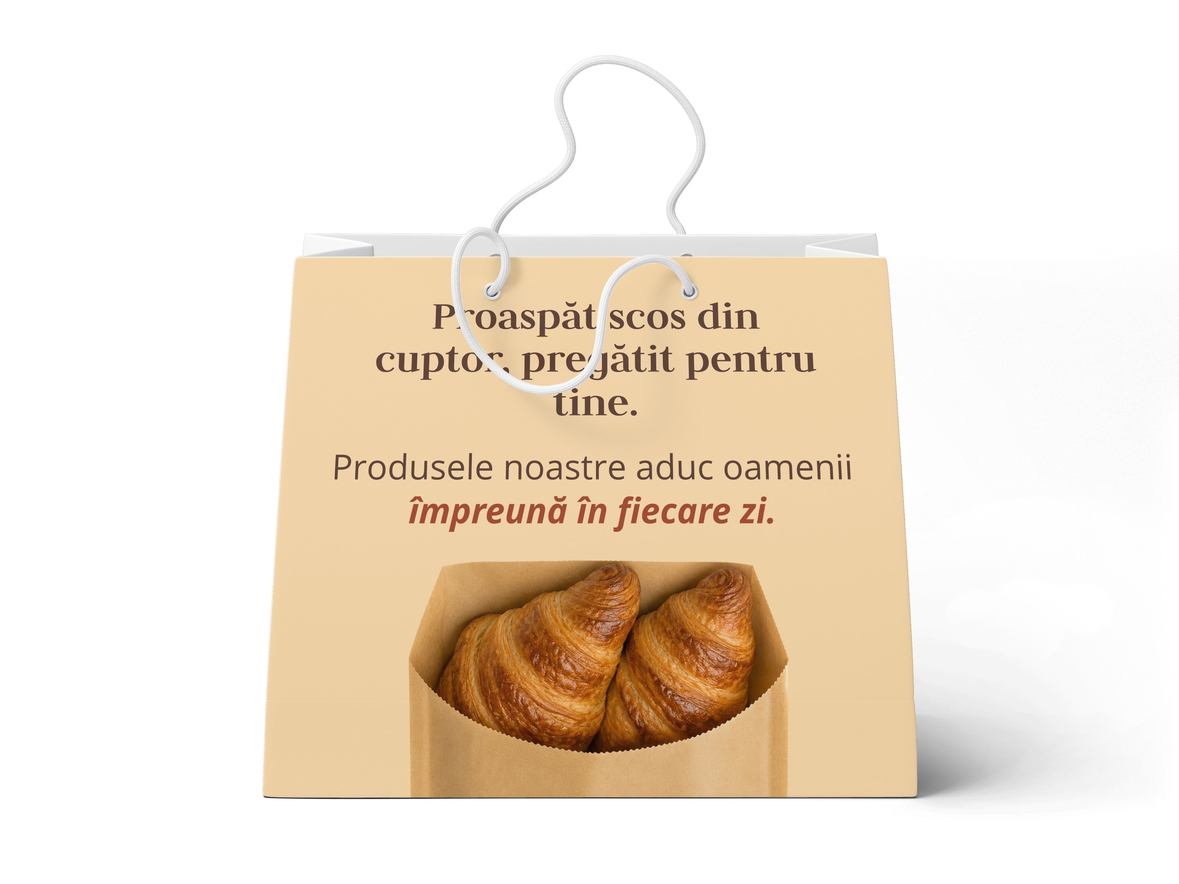
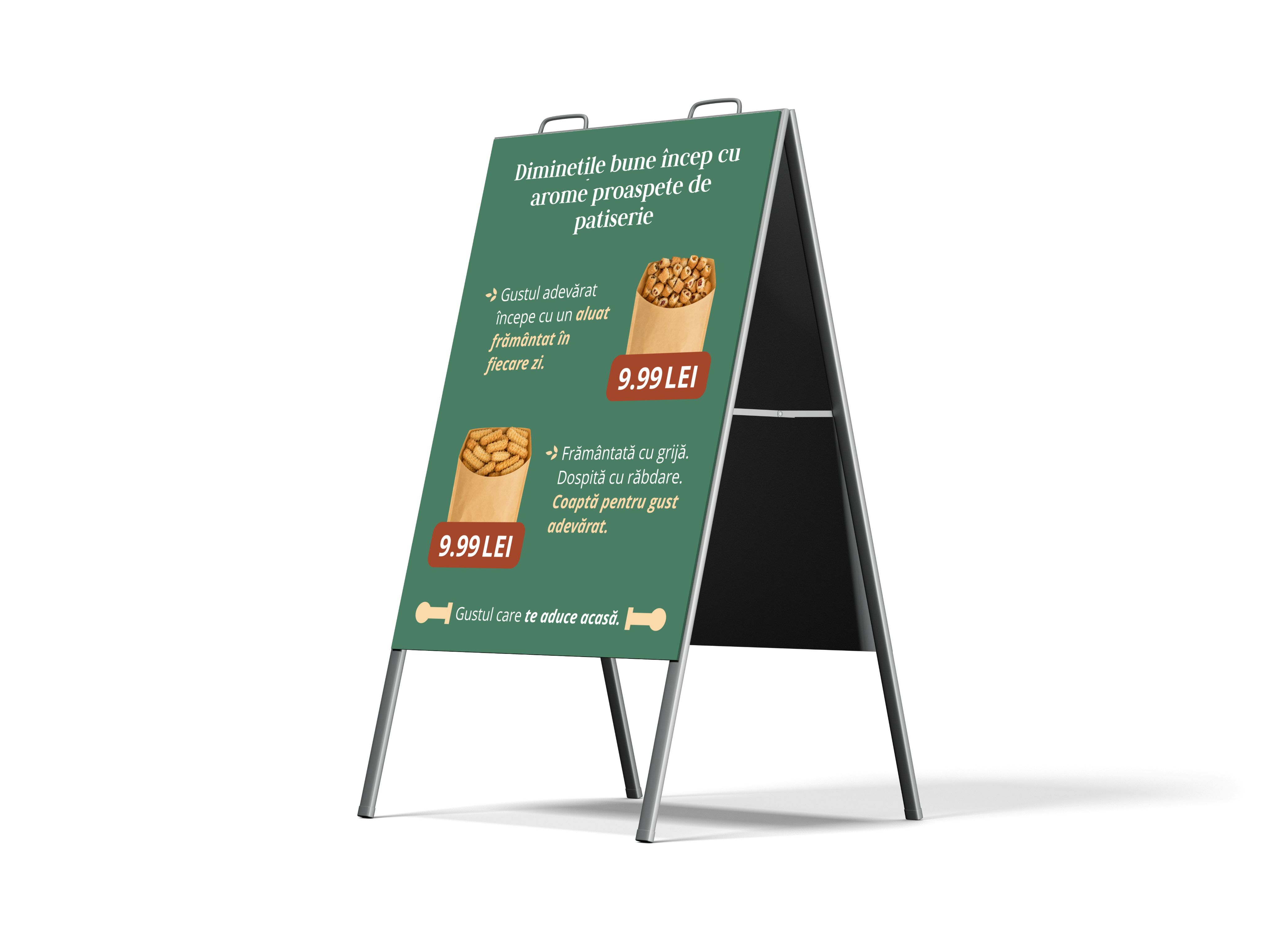
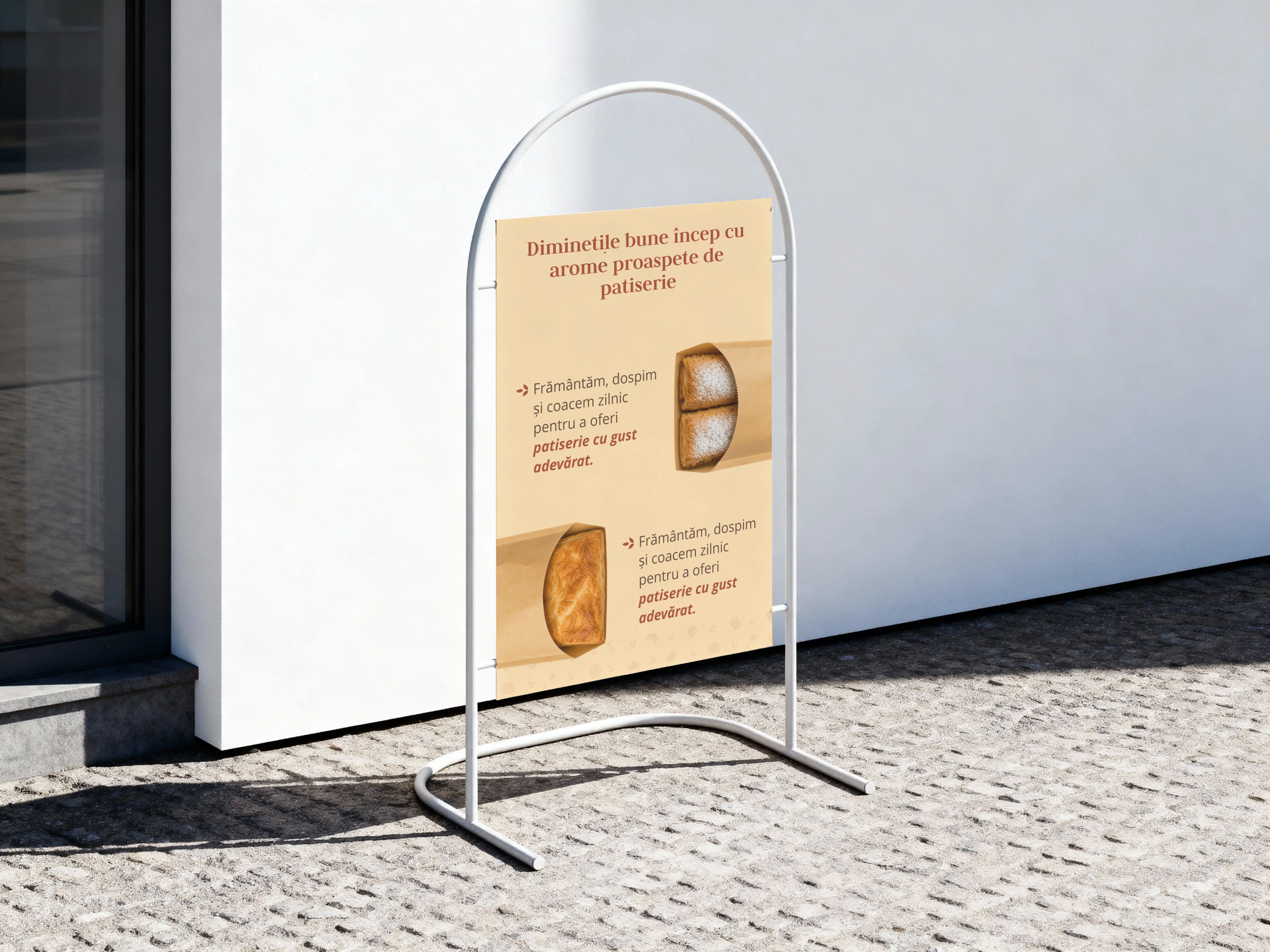
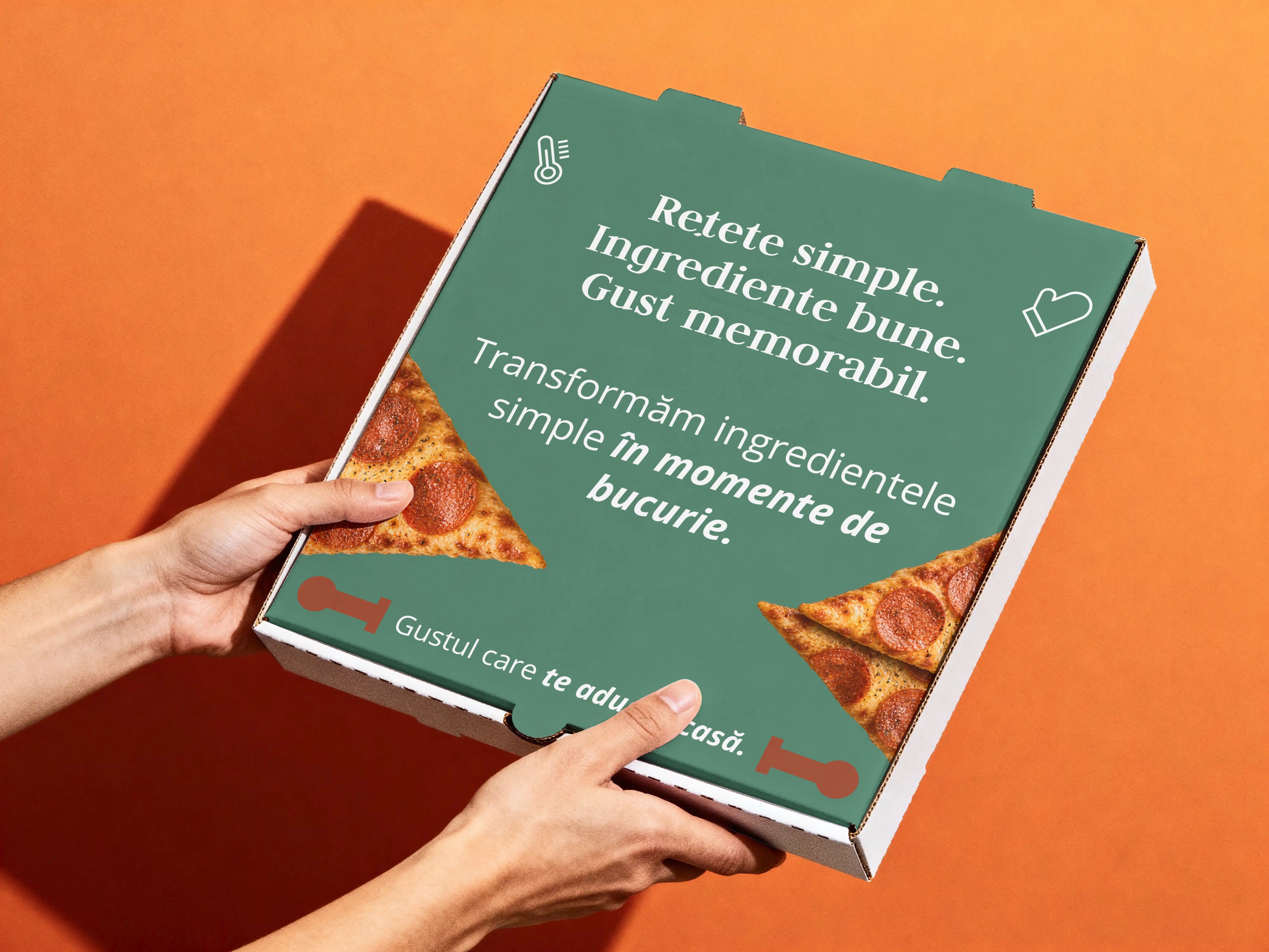
Most of the brand leaves the shop in someone’s hand: a coffee cup, a box of pretzels, a paper bag, a pizza box. So the mark is printed big and warm on every one of them, and the lines from the shop walls follow on the packaging: good mornings start with the smell of fresh pastry.
What it covers
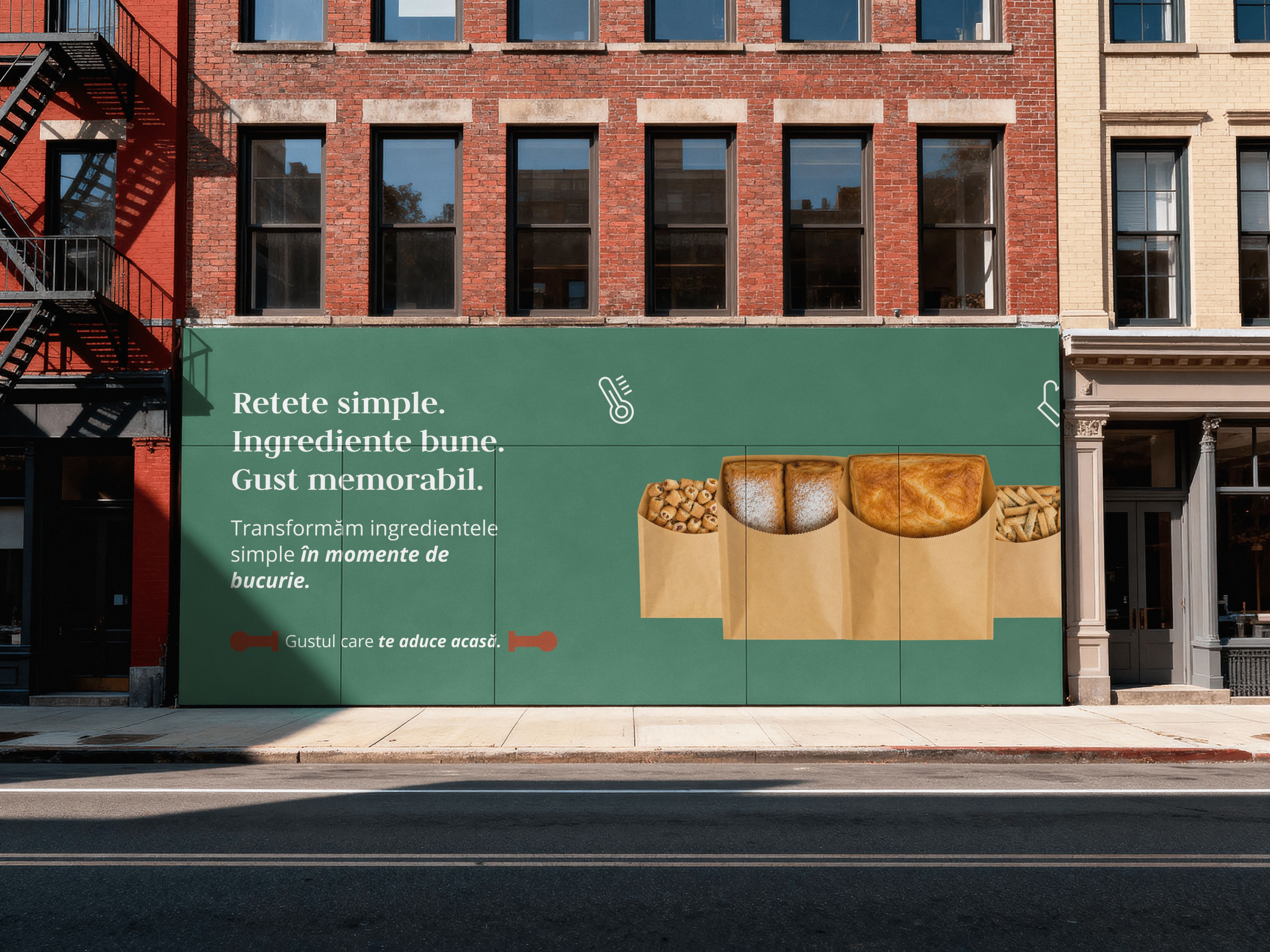
The logo, the palette and the type, a lit shop sign, street signs and a wall mural, cups, boxes, bags and takeaway sleeves, and posts for Instagram.