A to Z.
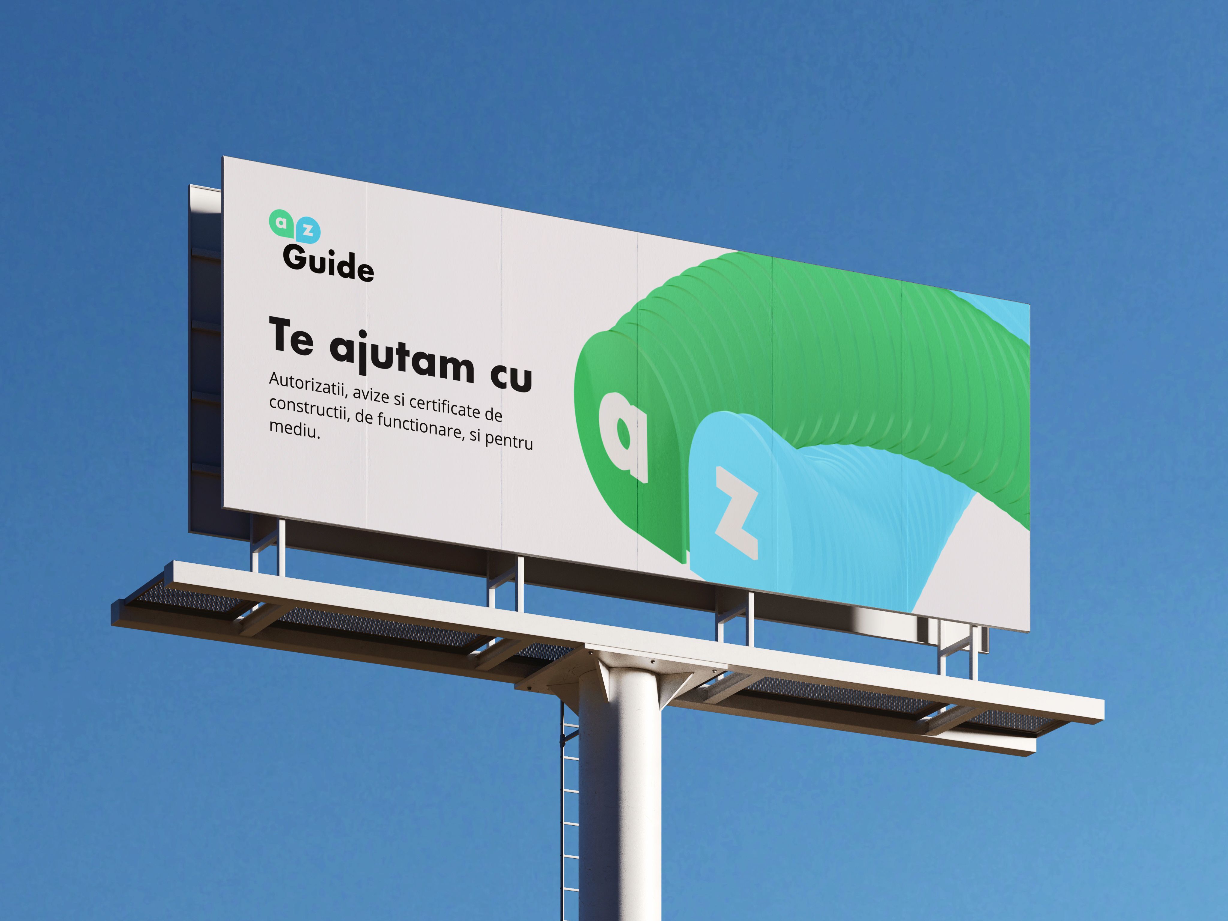
A to Z is a consultancy that walks companies through permits, approvals and certificates for building, running a business and meeting environmental rules. I designed the identity: two letters in two soft shapes, a fresh green and blue, and a calm look that makes paperwork feel manageable.
- Role
- Brand designer
- Scope
- Logo and identity
- Applied on
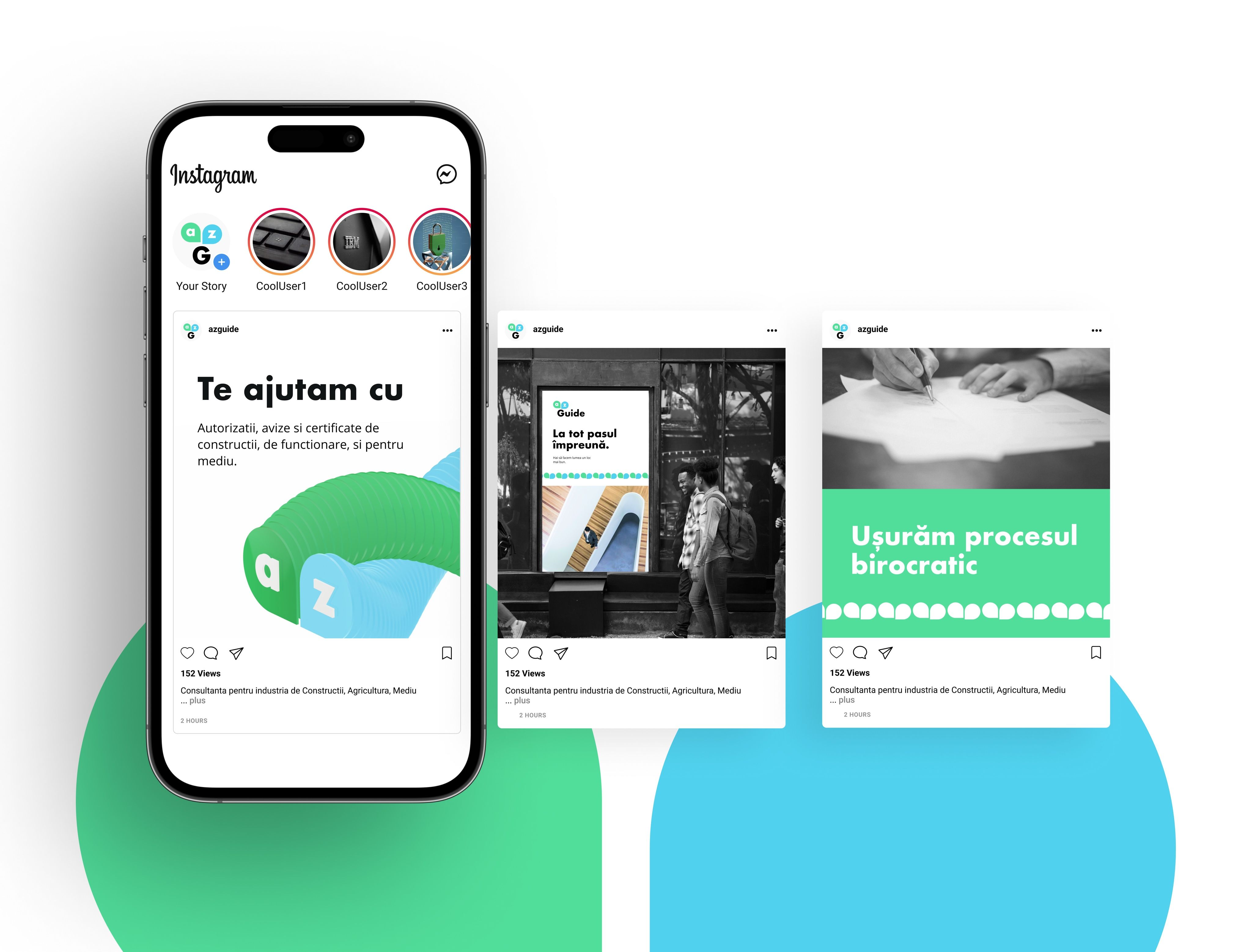
- Stationery, billboard, social
- Palette
- Green, blue, white
The idea
From the first form to the last stamp.
The name promises the whole road, so the mark is its two ends: an a and a z, each in its own round shape, side by side.
Green and blue keep it light. Paperwork is heavy enough; the brand should feel like the people who carry it for you.
Behind the mark
Two letters, two circles.
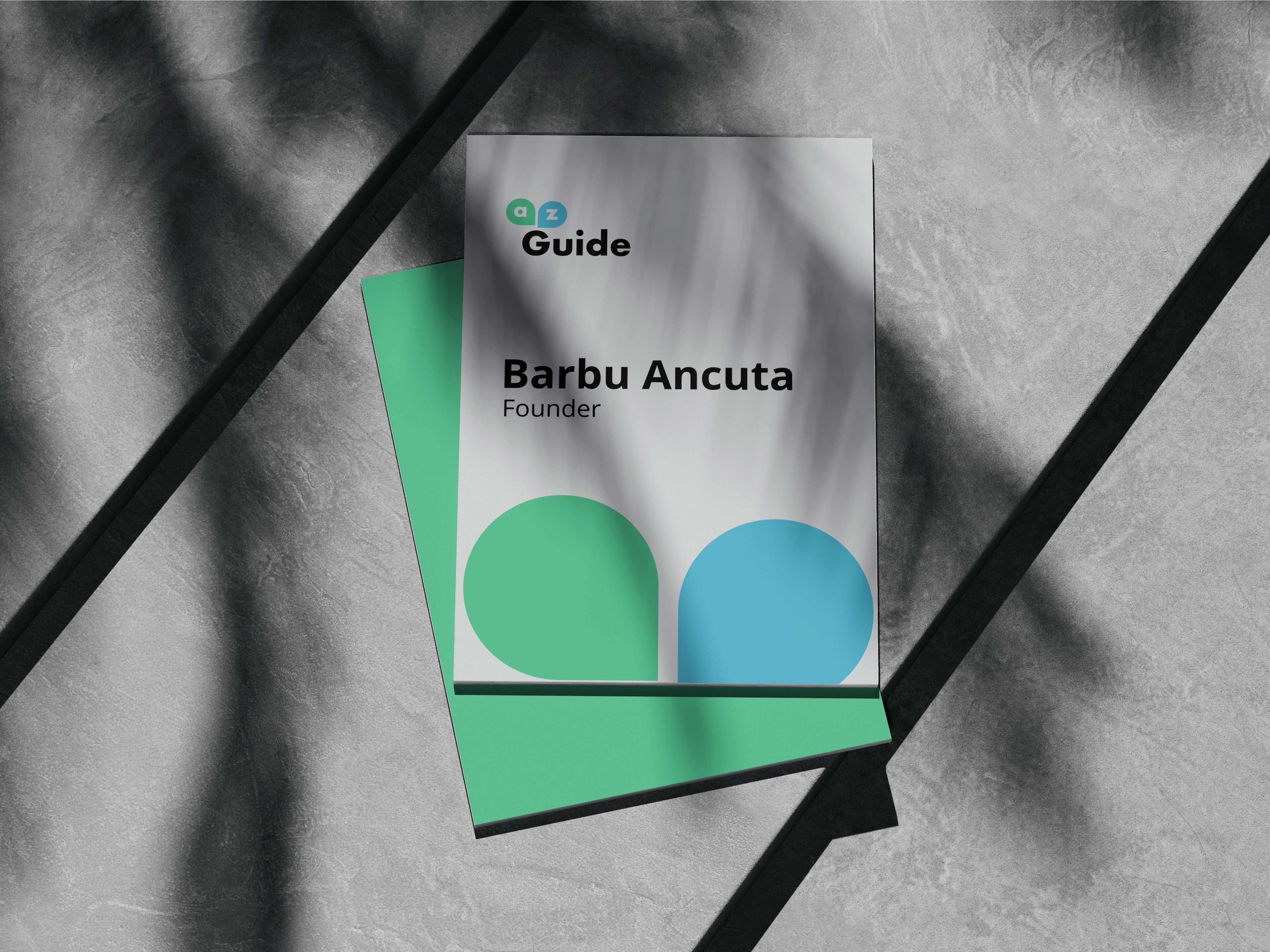
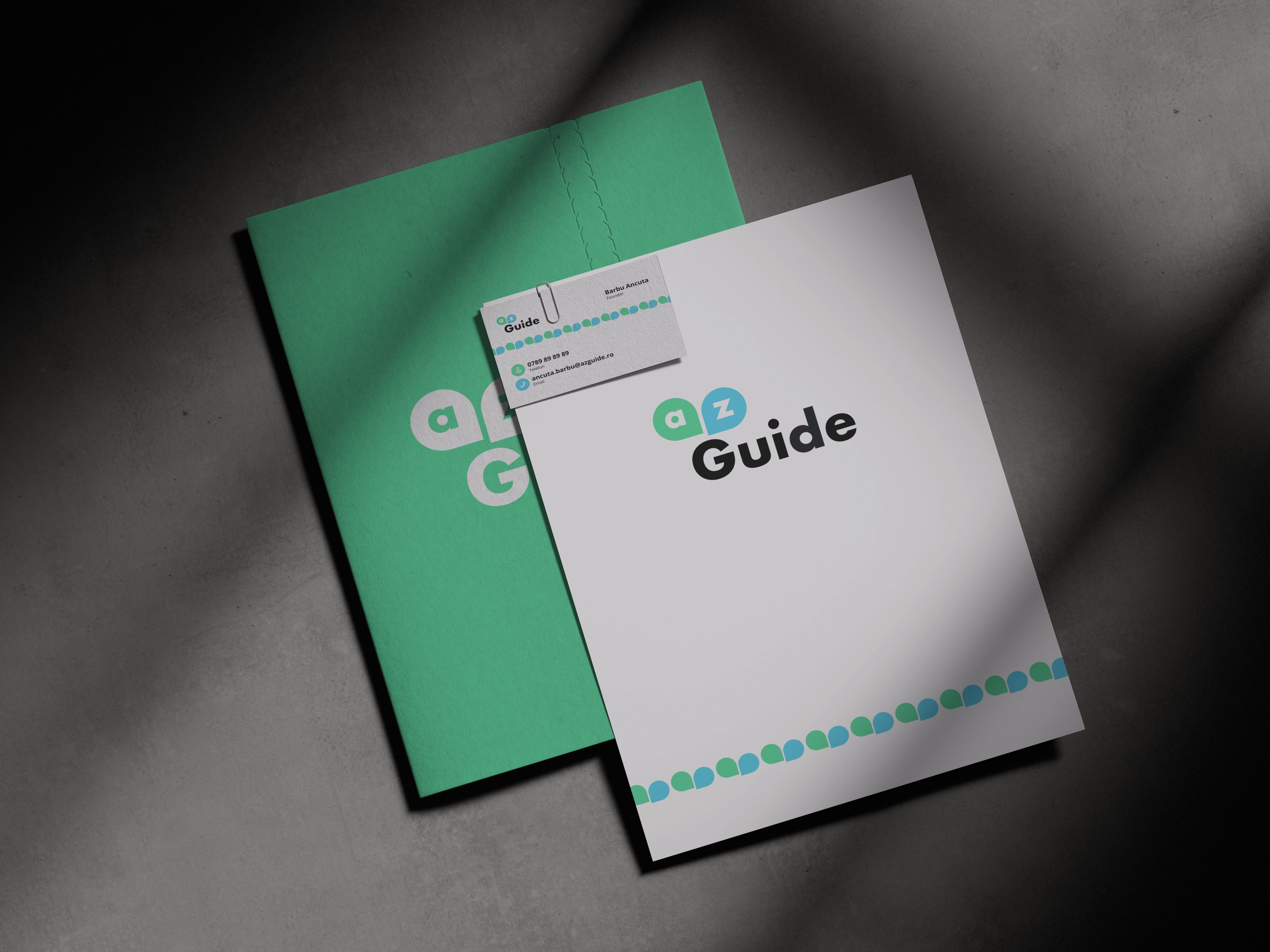
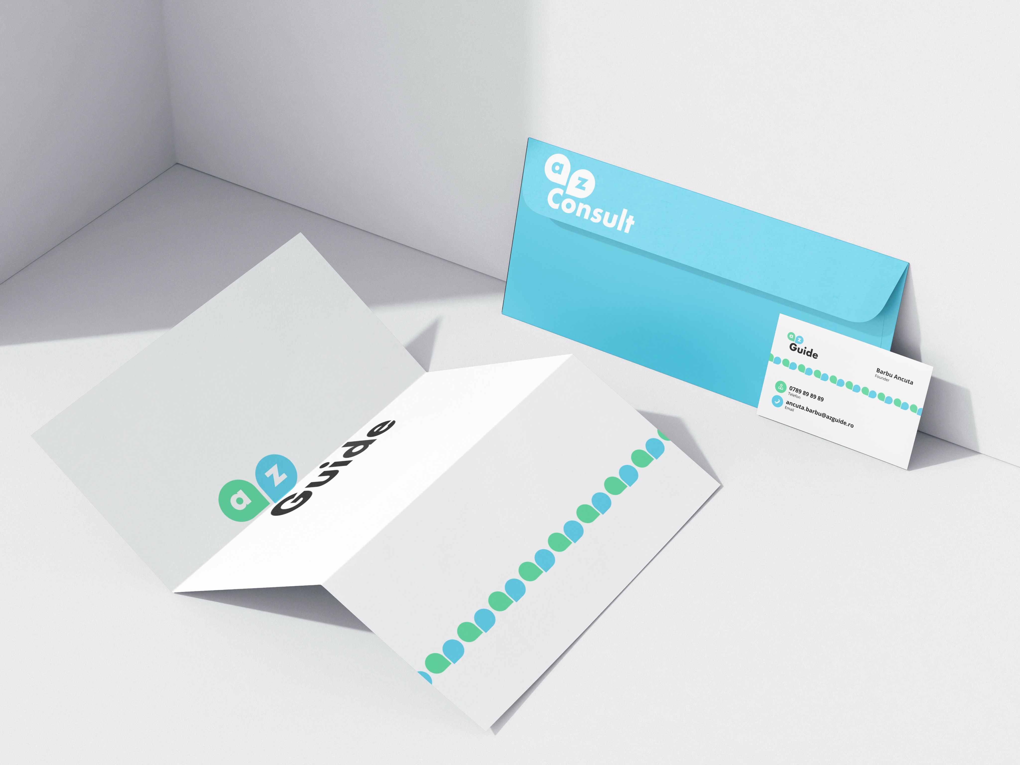
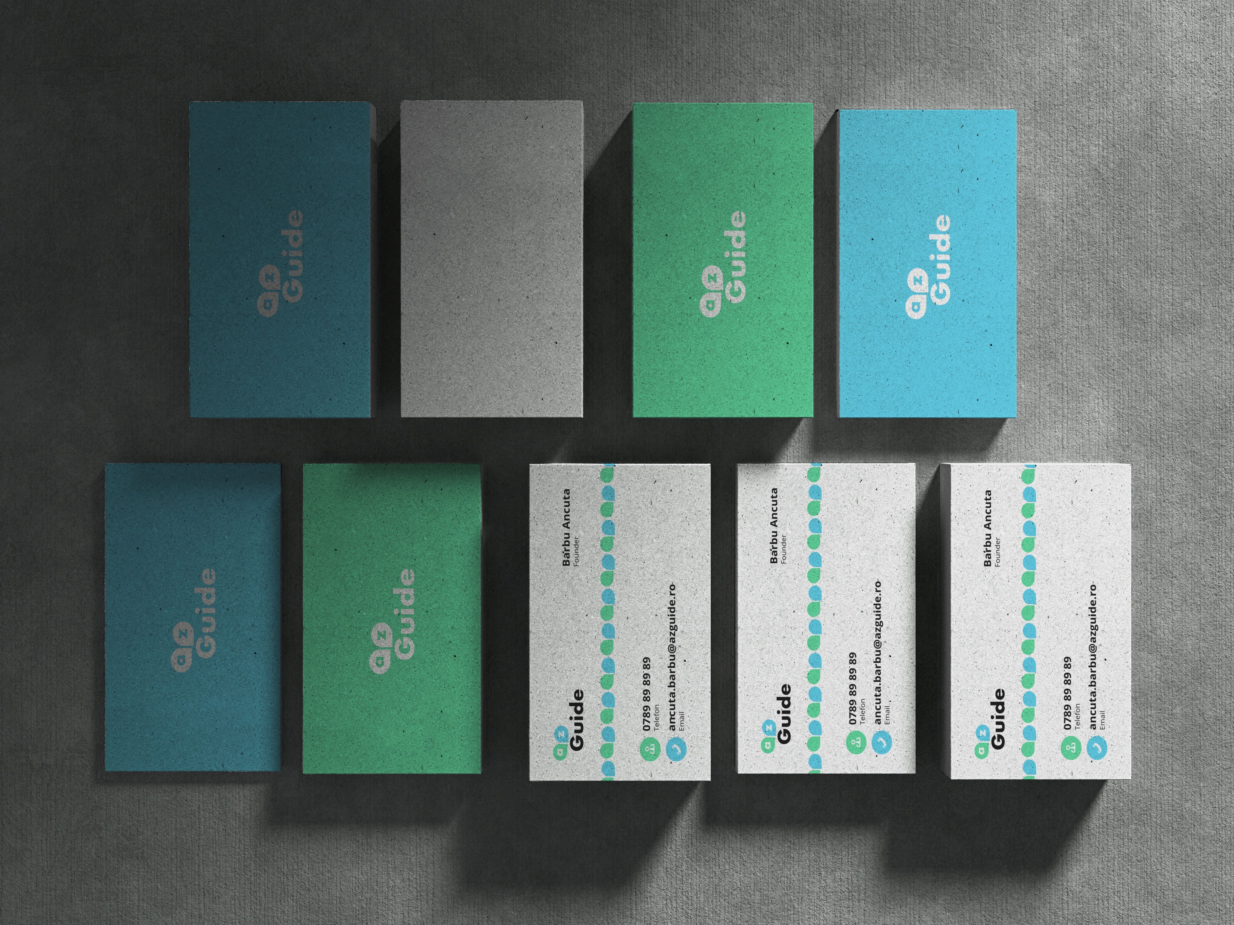
Large, the two shapes rise off a billboard like a page being turned. Lined up, they become a row of dots along the edge of a letter, a folder or a business card. Small, they sit above a word that changes with the service: Guide, Consult.
What it covers
The logo and its versions, business cards, a cover, a folder with its letter, an envelope, a billboard, and posts for Instagram.